


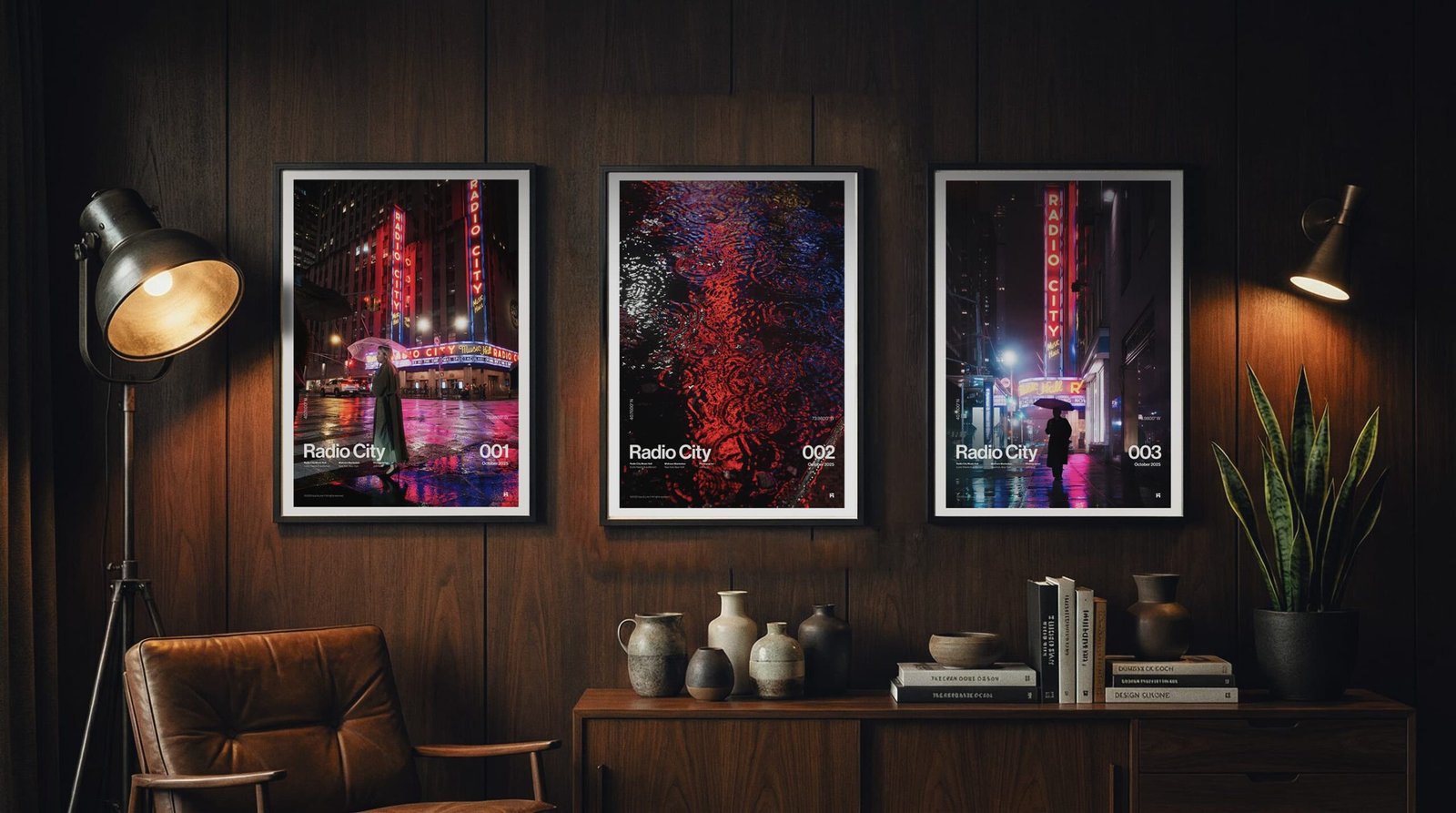
A Room Built Around Atmosphere
Some rooms ask for attention. Others earn it quietly. This space works because it doesn’t compete with what’s on the wall. The warm walnut paneling, soft leather chair, matte black frames, and restrained styling create a calm backdrop. Then three prints introduce what the room is missing: movement, color, and atmosphere.
Together, they transform a quiet room into one that feels connected to the energy of New York after dark.
Why This Room Works
There isn’t a single dominant color here until the artwork is introduced. The furniture stays within a narrow palette of walnut, charcoal, black, and warm leather. Lighting is soft and directional rather than bright and even. Every material has texture, but none of them shout. That restraint gives the artwork permission to do something dramatic.
The reds from the Radio City marquee become the room’s focal point. Reflections in the rain add magenta and electric blue without overwhelming the space. Instead of decorating around the room, the prints become the room’s source of energy.

A Story Told Across Three Prints
Rather than repeating the same image, this arrangement feels cinematic.
Radio City 001 establishes the scene with a wider street view and a solitary figure beneath an umbrella.
Radio City 002 moves closer, reducing the city to reflections and colour. It’s abstract enough to act almost like a painting.
Radio City 003 narrows the focus again, drawing your eye upward through the glowing vertical sign and the quiet silhouette below.
Viewed together, they feel less like three individual photographs and more like three moments from the same evening.
Why the Horizontal Layout Feels Balanced
Three equally sized prints create rhythm across the wall. Instead of relying on one oversized statement piece, the eye naturally moves from left to right, discovering new details in each frame. The spacing between the prints gives each photograph room to breathe while still allowing them to read as one composition. It’s a layout that works especially well above sideboards, credenzas, dining consoles, or long office cabinets where the furniture already provides a strong horizontal line.

The Details That Tie Everything Together
A few simple choices help the artwork feel integrated rather than added later:
- Black frames echo the lighting and architectural accents.
- White mats create breathing room around the photography.
- Warm timber softens the cooler tones within the images.
- Plants and ceramics introduce organic shapes against the clean geometry of the frames.
- Layered lighting allows the colours in the prints to become more vibrant after sunset.
None of these elements compete for attention. They simply support the artwork.
Works Well In
- Living rooms with walnut or oak finishes
- Home offices with dark cabinetry
- Reading rooms and libraries
- Condos with black accents and warm lighting
- Modern interiors that need one strong focal wall
The result isn’t a room that feels themed around New York. It feels like a thoughtfully designed space that borrows New York’s atmosphere. Sometimes that’s all a room needs. Three photographs, one wall, and just enough city light to change the mood.
Bring This Room Home
-
 View Print This product has multiple variants. The options may be chosen on the product page
Radio City — 001
New York RainPrice range: $50 through $100Archival Print -
View Print This product has multiple variants. The options may be chosen on the product page
Radio City — 002
New York RainPrice range: $50 through $100Archival Print -
View Print This product has multiple variants. The options may be chosen on the product page
Radio City — 003
New York RainPrice range: $50 through $100Archival Print


